
Sync Insights
Canton Network analytics. Built for institutional DeFi teams.
All Content by Sync Insights
Visualize Canton Wallet Connections with Network Graphs
Turn Canton transfer data into a visual map — showing wallets and providers as connected nodes, with clusters and interaction patterns visible at a glance.
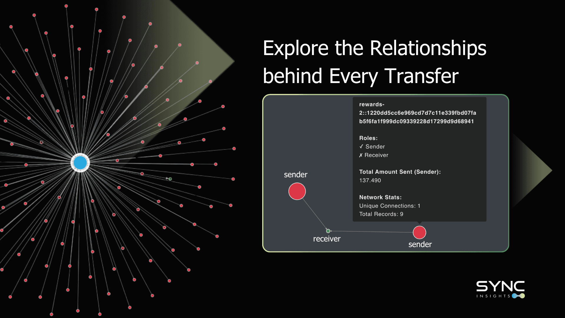
Mapping Wallet Relationships on the Canton Network
When you're exploring activity on the Canton Network, rows of transactions make it difficult to see relationships, identify clusters, or follow the flow of value. Spreadsheets don't reveal how wallets actually interact. Get a unique option to visualize: Who's connected to whom, which wallets matter most, how transfers form relational patterns, and where activity concentrates in the network.
Wallet connections and transfer relationship vizualiasation
Anyone trying to understand activity on the Canton Network hits the same wall: the transfers are there, but you cannot easily visualize the relationships behind them. Get a unique option to visualize: - Who's connected to whom - Which wallets matter most - How transfers form relational patterns - Where activity concentrates in the network