
If you're trying to understand what's happening on the Canton Network, transfer data only tells you part of the story. You can see that value moved, but not who's connected to whom, which wallets or providers interact most, or where activity is clustering. That missing context makes it hard to spot patterns, investigate anomalies, or make confident decisions.
Network Graph, from Sync Insights, closes that gap, and the outcomes are immediate and concrete:
You can finally answer the questions that matter:
- Which wallets are actually connected, and how?
- Which providers interact most often?
- Where is activity concentrating, and is that concentration healthy or a red flag?
- How do rewards and fees link participants together across the ecosystem?
Instead of digging through thousands of rows to piece together an answer, you get it visually, in seconds.
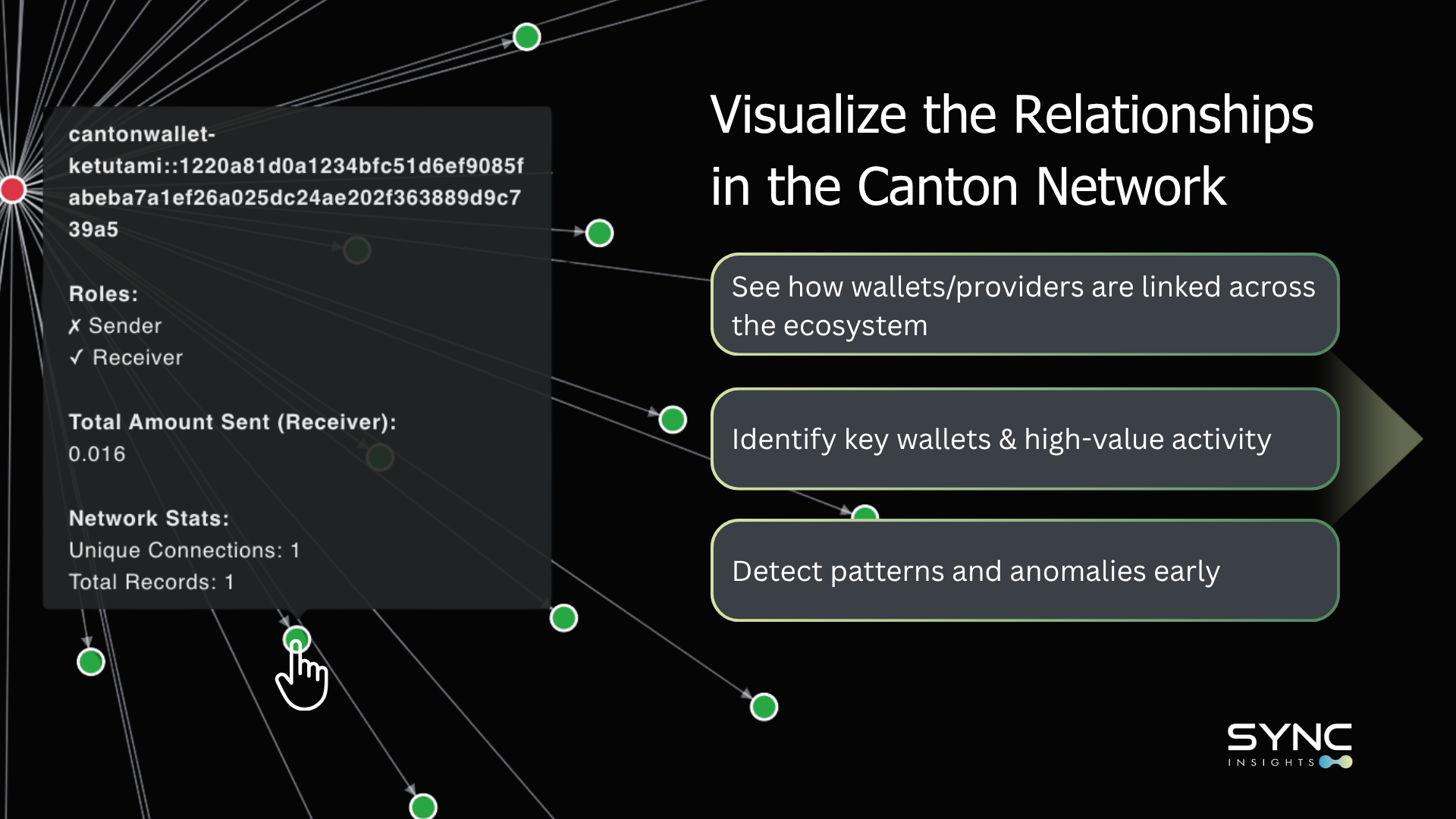
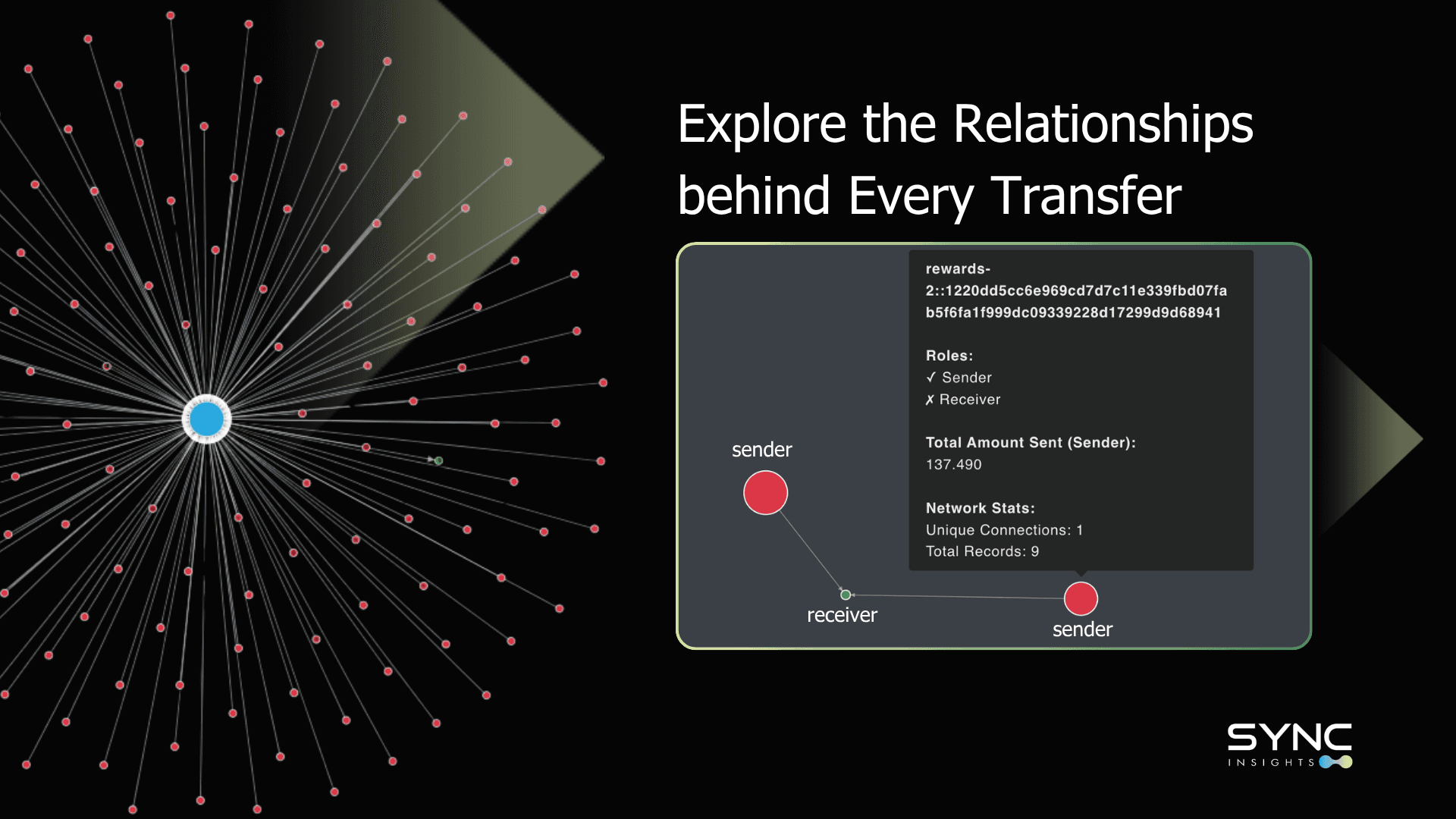
Every wallet, provider, or application becomes a node; every transfer becomes a directional edge between them. Nodes cluster automatically based on how frequently they interact, so tightly connected participants group together without any manual work on your part.
You shape the view to fit the question in front of you: filter by time range, participant type, or transaction category to isolate a reward cycle, a provider's activity, or one wallet's full history. Zoom into any node to see its direct connections, or zoom out to take in the shape of the entire network at once.
What that means in practice:
- A capability nothing else in the Canton ecosystem offers. Most tools stop at tables and transaction lists. Network Graph is built specifically around the questions participants actually ask — not just "what happened," but "how is everything connected."
- Faster root-cause analysis. When rewards spike unexpectedly, or funds move in a way that raises questions, you're not stuck reconstructing the story from spreadsheets. You can trace exactly which wallets contributed and where the flow actually originated in the moment.
- Better-supported governance decisions. Instead of relying on intuition or incomplete data, you can point to a clear, visual picture of network relationships when evaluating performance or making operational calls.
The result: whether you're analyzing reward flows, evaluating a provider's performance, or chasing down an anomaly, you get clarity in seconds instead of hours, and a genuine understanding of how the network fits together, not just a record of what moved.
Pick a wallet, a provider, or a spike in activity — Network Graph shows you the relationships behind it.